
Dynamic Control
📘 Developer Guide
With the Dynamic Control Bricks, you are able to provide different types of input for your forms.
🔁 Example
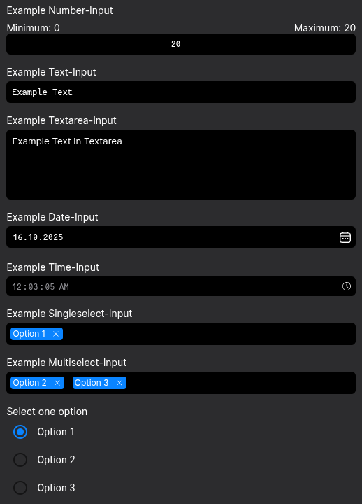
Designer
Runtime
⚙️ Configuration Properties
| Key | Label | Description | Default Value |
|---|---|---|---|
type * |
The type of the Dynamic Control | Defines the Type of the DCC by string. See Available TypesDYNAMIC_CONTROLC_COMPONENT |
- |
value |
The value of the Dynamic Control | Sets the initial value of the Dynamic Control. Can be empty. It will be applied until the input is dirty.any |
- |
placeholder |
The inputs placeholder | Defines the placeholder, which gets rendered in the input as long as no value existsstring | FyzTranslationConfig |
- |
required |
Sets the requirement of the input | Defines if a input is required or not. It will be marked and validation will be executed.boolean |
- |
label |
Sets the label of the input | Renders a configurateable label in proximity of the input. Positioning depends on styling and DCC-Typestring | FyzTranslationConfig |
- |
disabled |
Toggles the disabled state of the input | When disabled, it's not possible, to input data into the inputboolean |
- |
validators |
Defines a list of validators | Adding validators to the property, each input value will be validated against a provided functionFyzValidator[] |
- |
changeMode |
Specifies the kind of saving the code to the brick | The saving behavior depends on the choosen option. always saves the code on every change.debounced takes the debounceTime time, which delays the saving of the code on repeated strokesonBlur saves the code after the user leaves the editors window focusalways | debounced | onBlur |
debounced |
debounceTime |
Specifies the debounce time | Accepts a number in milliseconds (ms)number |
300 |
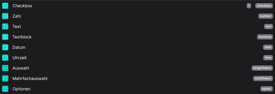
🧑💻 Available Types
enum DYNAMIC_CONTROLC_COMPONENT  {
    TEXT = 'text',
    DATE = 'date',
    TIME = 'time',
    SINGLE_SELECT = 'singleSelect',
    MULTI_SELECT = 'multiSelect',
    TEXTAREA = 'textarea',
    CHECKBOX = 'checkbox',
    NUMBER = 'number',
    RADIO_BUTTON = 'radioButton',
    DATE_TIME_PICKER = 'dateTimePicker',
    SWITCH = 'switch'
}
🧨 Events
| Event-Name | Action | Description |
|---|---|---|
valueChanged |
Fires on update |
Emits the value of the inputControl when it changesany |
valueChangedOnBlur |
Fires on update |
Emits the value of the inputControl when it changes after a blur eventany |
valueChangedDebounced |
Fires on update |
Emits the value of the inputControl when it changes after a debounceTimeany |
valueChangedConfigured |
Fires on update |
Based on the configuration [config->changeMode], emits the value of the inputControl when it changesany |
validChanged |
Fires on update |
Emits the valid status of the inputControl when it changesboolean |
statusChanged |
Fires on update |
Emits the status of the inputControl when it changesFormControlStratus |
🛠️ Usage
Designer
Use the configurators in the right side nav for setting up you control. There are different configurations for each Type
⌨️ Programmatical Data
How to read values via fyzBrick.cRef.value
This will let you get the current value of the Control
// ⚙️ Retrieve the current value of the DCC
const value = fyzBrick.cRef.value;
// 🧑💻 Work with the value
console.log(value);
How to read values via fyzBrick.cRef.value$
This will let you subscribe to an RXJS Stream, in which value changes will be emitted
// ⚙️ Retrieve the current value of the DCC via a observable subscription
const value$ = fyzBrick.cRef.value$;
// 🧑💻 Subscribe and work with value changes
value$.subscribe((value) => {
console.log(value);
};