
Icon
📘 Developer Guide
With the Icon Brick, you can easily add icons to your dashboards.
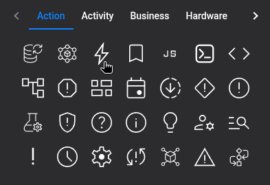
Either use the Icon Picker in the right Side-Nav to choose your icon, or directly edit the configuration of the brick.
🔁 Example
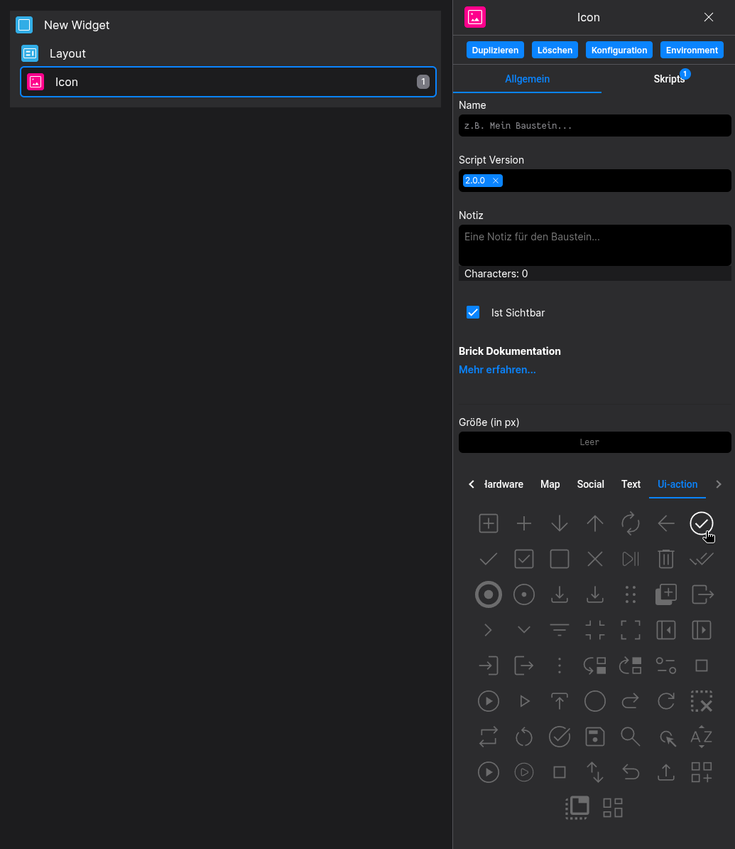
Designer
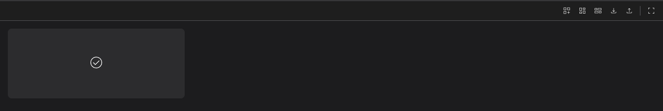
Runtime
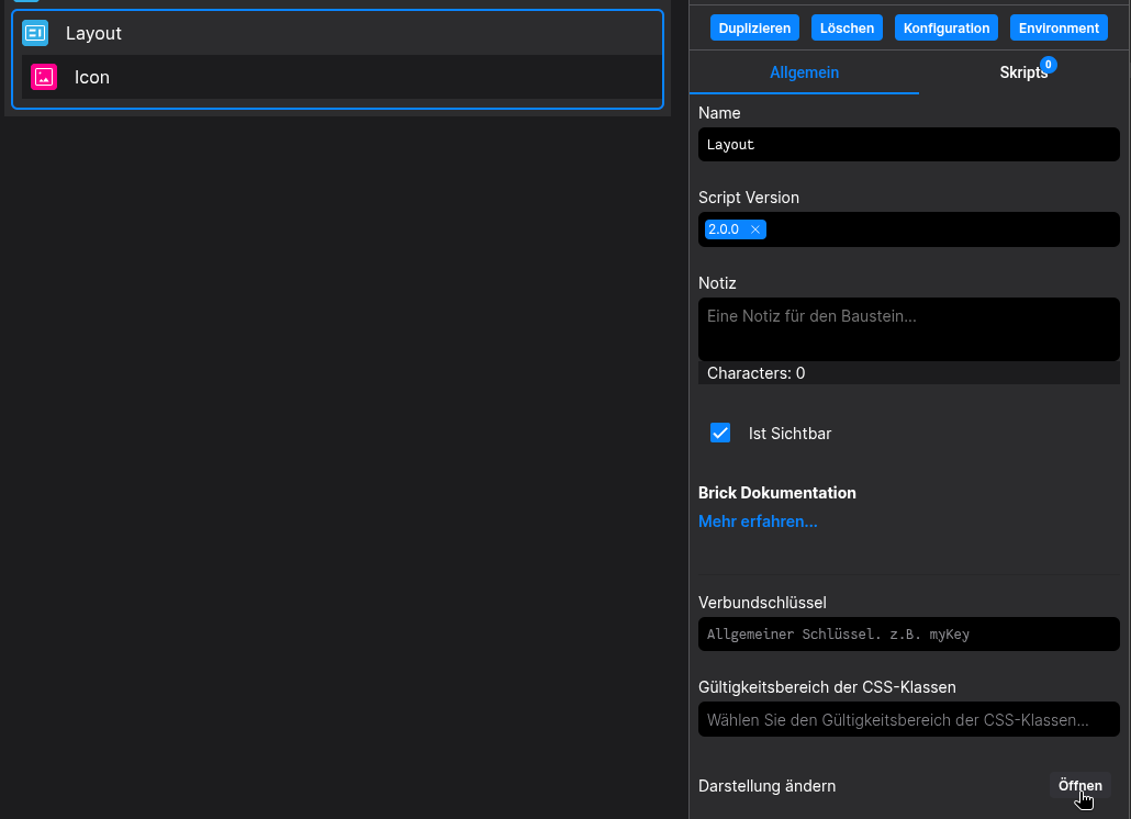
⚙️ Configuration Properties
| Key | Label | Description | Default Value |
|---|---|---|---|
id |
ID of the Icon | Can be selected using CSS via #flyze-icon-idstring UUID |
Random UUID |
version |
Decider for the version of the Icon | Always use modern, since legacy will be removed in the future.It just exists for backward compatibility modern legacy |
legacy |
size * |
The size of the Icon | Defines the size of the Icon. Use custom to create your own sizes.xsmall | small | medium | large | xlarge |
default |
| | ||
iconName |
The Icon Name | e.g. ecoExplore all available icons | |
| | ||
| string |
- | |
customSvg |
A custom SVG string | Lets you include your own custom SVG.string |
- |
🎨 CSS Variables
Further the icon defines the variables The (These
Variable Name
Description
--fyz-sb-icon-sizeSize of the icon
--fyz-sb-icon-auto-size@see
-auto- variablesallowyou
to override predefined states without using !important)
--fyz-sb-icon-width:widthWidth of the
Iconicon. --fyz-sb-icon-size
--fyz-sb-icon-height:heightHeight of the
Iconicon. --fyz-sb-icon-size
--fyz-sb-icon-fill:Fill color of the
Iconicon. Falls back to --system-label if not set
--svg-width and --svg-height to set the width and height of the svg inside the icon. The are used by default if a custom svg is given.
-auto- variables are used to automatically adjust the respective property based on device view or respective parent components. They should not be set directly by the user. For each -auto- variable, there is a corresponding non--auto- variable that can be set by the user to override the automatic behavior.
🛠️ Usage
Designer
(Simply click the desired icon, the configuration will be updated automatically)
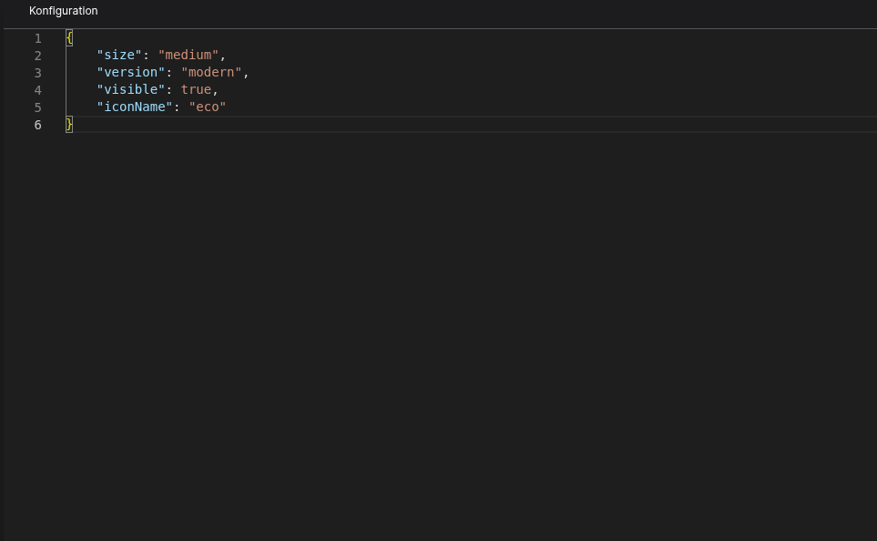
Config
⌨️ Programmatical Data
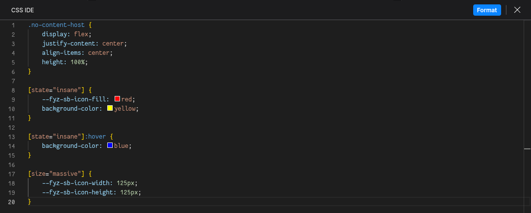
How to style custom States/Sizes
This example shows how to style your Icon via CSS.
(In this example, customStateName is set to insane and customSizeName to massive)
[state="insane"] {
  --fyz-sb-icon-fill: red;
  background-color: yellow;
}
[state="insane"]:hover {
  background-color: blue;
}

[size="massive"] {
  --fyz-sb-icon-width: 125px;
  --fyz-sb-icon-height: 125px;
}
Use the Layout Brick to style icons based on this example.
How to load in a custom SVG
(If your custom Icon uses inline sizing, just set the size to custom)
const config: FyzSbIconConfig = {
  version: 'modern',
  size: 'custom'medium',
  customSvg: `<svg>"{{ {...SVG as string } </svg>`}"
};
How to update the icon via Scripting
// ⚙️ Retrieve the current configuration of the Brick
const config = fyzBrick.cRef.getConfig();

// 💱 Modify and merge the config to change to the desired icon/behavior
fyzBrick.cRef.mergeConfig({ ...config,state: iconCategory: 'social'"customState", iconName: 'eco',
  size: 'xlarge',
  customStateName: 'insane'"error" });