Table
📘 Developer Guide
With the Table Brick, you are able to implement a fully fletched Table into your Dashboards. The Table supports several features. Check the Configuration Properties for more information.
🔁 Example
Designer

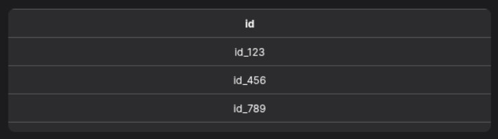
Runtime
⚙️ Configuration Properties
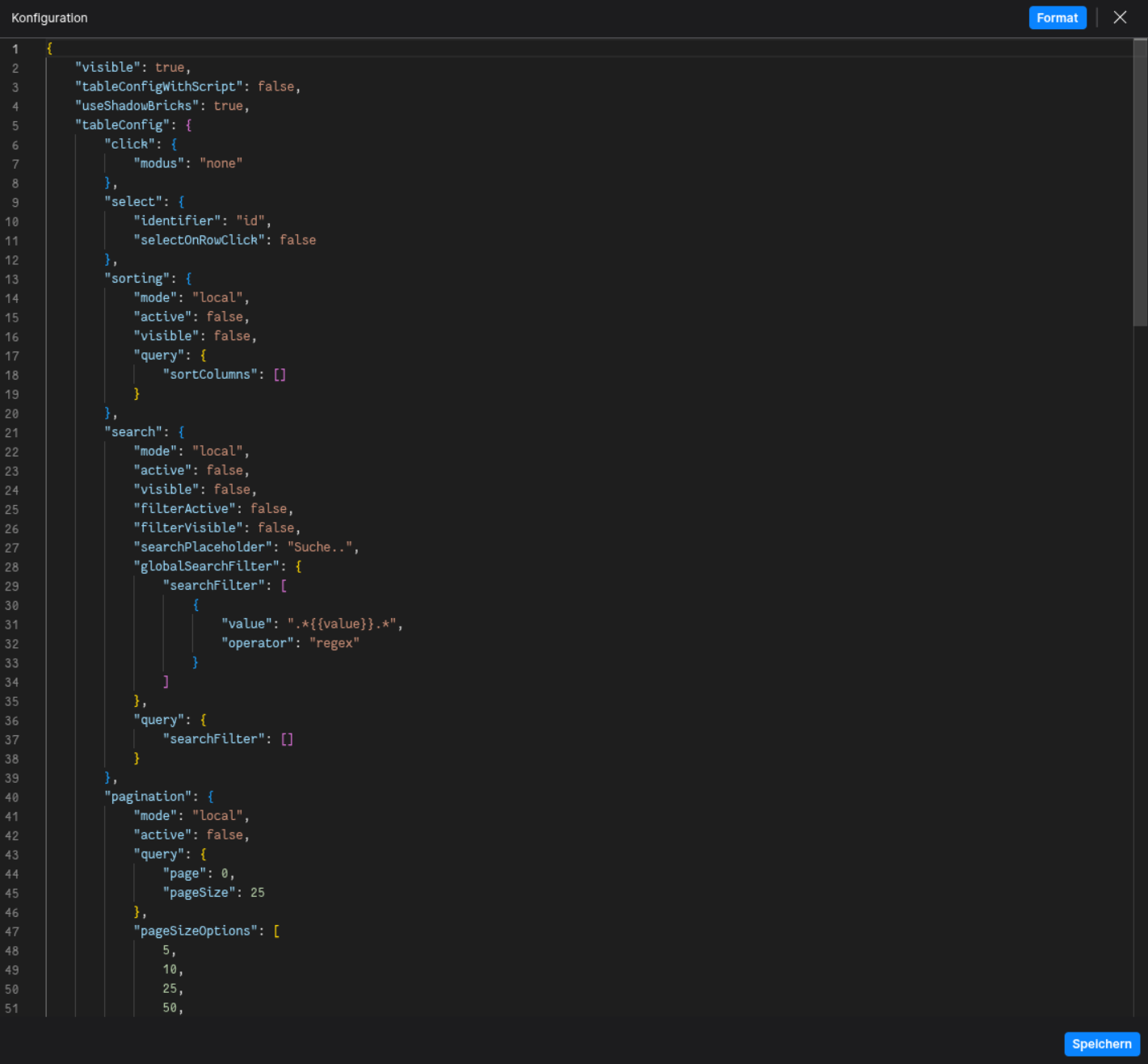
config
| Key |
Label |
Description |
Default Value |
grid |
The Data Table Grid Definition |
Holds the definition of header and body columns
DataTableDefinition |
- |
defaultStyles |
Default Table Styles |
Defines default styles for header and body
TableDefaultStyles |
- |
click.modus |
Defines if the table focuses specific sections of the table on click |
Determines clickable area of the table
row | cell | none |
none |
select |
The selection configuration |
Defines row or cell selection behavior. Find out more under SelectionConfig
SelectionConfig |
- |
sorting |
The sorting configuration |
Defines how sorting is handled. Find out more under SortingConfig
SortingConfig |
- |
search |
The search configuration |
Defines table search behavior. Find out more under SearchConfig
SearchConfig |
- |
pagination |
The pagination configuration |
Defines paging behavior. Find out more under PaginationConfig
PaginationConfig |
- |
footerConfig |
The footer configuration |
Configuration for the table’s footer. Find out more under FooterConfig
FooterConfig |
- |
toolbarConfig |
The toolbar configuration |
Configuration for the table’s toolbar. Find out more under ToolbarConfig
ToolbarConfig |
- |
| Key |
Label |
Description |
Default Value |
nowrap |
If text is text only single lined |
If true, text will be in one line
boolean |
false |
height |
The height of the header |
Accepts a string like 42px
string |
42px |
minHeight |
The minimum height of the header |
Accepts a string like 50px
string |
null |
padding |
The padding of the header |
Accepts a string like 12px 5px 12px 5px
(Top, Right, Bottom, Left)
string |
0px |
font.size |
The font size of the header |
Accepts a string like 14px
string |
12px |
font.weight |
The font weight of the header |
Accepts a string like 400 or bold
string |
normal |
font.color |
The font color of the header |
Accepts a string like #000 or rgb(0,0,0)
string |
- |
outsideBorder |
Toggles the outside border visibility |
Accepts either true or false
boolean |
false |
isVertical |
Toggles if the text is vertical |
Accepts either true or false
boolean |
false |
sticky.active |
Toggles if the header is sticky |
Accepts either true or false
boolean |
false |
sticky.position |
Defines the sticky header position |
Accepts either top or bottom |
top |
BodyDefaultStyles (config.defaultStyles.body)
| Key |
Label |
Description |
Default Value |
nowrap |
If text is text only single lined |
If true, text will be in one line
boolean |
false |
height |
The height of each body cell |
Accepts a string like 42px
string |
42px |
minHeight |
The minimum height of each body cell |
Accepts a string like 50px
string |
null |
padding |
The padding of each body cell |
Accepts a string like 12px 5px 12px 5px
(Top, Right, Bottom, Left)
string |
0px |
font.size |
The font size of each body cell |
Accepts a string like 14px
string |
12px |
font.weight |
The font weight of each body cell |
Accepts a string like 400 or bold
string |
normal |
font.color |
the font color of each body cell |
Accepts a string like #000 or rgb(0,0,0)
string |
- |
outsideBorder |
Toggles the outside border visibility of cells |
Accepts either true or false
boolean |
false |
TooltipOptions (BodyColumn.tooltip, BodyCell.tooltip)
| Key |
Label |
Description |
Default Value |
tooltipProp |
The tooltip property of which the text is taken |
Accepts a string
string |
- |
tooltipFunction |
The tooltip function which computes the tooltip |
Provide a function as string
string |
- |
| Key |
Label |
Description |
Default Value |
title |
The toolbar title |
Title displayed in the action toolbar
string |
- |
sorting |
The sorting configuration |
Defines how sorting is handled. Find out more under SortingConfig
SortingConfig |
- |
search |
The search configuration |
Defines table search behavior. Find out more under SearchConfig
SearchConfig |
- |
headerColumns |
Defines the header columns |
Array of header columns displayed in the toolbar
HeaderCell[] |
- |
actions.addButtonVisible |
Toggles the add button visibility |
Accepts either true or false
boolean |
- |
actions.addButtonLabel |
Defines the add button label |
string |
- |
actions.addMoreButtonVisible |
Toggles the add more button visibility |
Accepts either true or false
boolean |
- |
| Key |
Label |
Description |
Default Value |
active |
Toggles if the footer is active |
Enables or disables the footer
boolean |
- |
actionFooterConfig |
The action footer configuration |
Defines the action footer behavior. Find out more under ActionFooterConfig
ActionFooterConfig |
- |
sticky.active |
Sticky Footer |
Enables sticky positioning
boolean |
- |
sticky.position |
Sticky Position |
Position of sticky footer: top or bottom |
- |
| Key |
Label |
Description |
Default Value |
active |
Toggles if the action footer is active |
Accepts either true or false
boolean |
- |
paging |
The pagination configuration |
Defines paging behavior. Find out more under PaginationConfig
PaginationConfig |
- |
| Key |
Label |
Description |
Default Value |
visible |
Toggles the toolbar visibility |
Shows or hides the manipulation toolbar
boolean |
- |
headerColumns |
Defines the header columns |
Columns displayed in the manipulation toolbar
HeaderCell[] |
- |
sortingQuery |
Defines the sorting query |
Find out more under SortingChangeEvent
SortingChangeEvent |
- |
filteringQuery |
Defines the filtering query |
Find out more under SearchChangeEvent
SearchChangeEvent |
- |
actions.saveVisible |
Toggles the save button visibility |
Accepts either true or false
boolean |
- |
actions.saveMoreVisible |
Toggles the save more button visibility |
Accepts either true or false
boolean |
- |
actions.resetVisible |
Toggles the reset button visibility |
Accepts either true or false
boolean |
- |
| Key |
Label |
Description |
Default Value |
active |
Toggles the toolbar |
Accepts either true or false
boolean |
- |
headerColumns |
Defines the header columns |
Columns displayed in the toolbar
HeaderCell[] |
- |
actionToolbarConfig |
The action toolbar configuration |
Defines the action toolbar behavior. Find out more under ActionToolbarConfig
ActionToolbarConfig |
- |
manipulationToolbarConfig |
The manipulation toolbar configuration |
Defines the manipulation toolbar behavior. Find out more under ManipulationToolbarConfig
ManipulationToolbarConfig |
- |
sticky.active |
Toggles the sticky toolbar |
Accepts either true or false
boolean |
- |
sticky.position |
Sets the toolbars sticky position |
top | bottom |
- |
SelectionConfig (config.select)
| Key |
Label |
Description |
Default Value |
selectOnRowClick |
Toggles select on row click behavior |
Accepts either true or false
boolean |
- |
identifier |
The selection identifier |
Key of the object which is selected
string |
'id' |
SortingConfig (config.sorting)
| Key |
Label |
Description |
Default Value |
mode |
Defines the data manipulation mode |
Accepts either local or remote
DataManipulationMode |
- |
active |
Toggles sorting is active |
Enables or disables sorting
boolean |
- |
visible |
Toggles sorting is visible |
Shows or hides sorting UI
boolean |
- |
query |
Defines the sorting query |
Find out more under SortingChangeEvent
SortingChangeEvent |
- |
SearchConfig (config.search)
| Key |
Label |
Description |
Default Value |
mode |
Defines the data manipulation mode |
Accepts either local or remote
DataManipulationMode |
- |
active |
Toggles if search is active |
Accepts either true or false
boolean |
- |
visible |
Toggles if search is visible |
Accepts either true or false
boolean |
- |
filterActive |
Toggles if filter is active |
Accepts either true or false
boolean |
- |
filterVisible |
Toggles if filter is visible |
Accepts either true or false
boolean |
- |
query |
Defines the filtering query |
Find out more under SearchChangeEvent
SearchChangeEvent |
- |
searchPlaceholder |
Defines the search placeholder |
Placeholder text for the search input
string |
- |
globalSearchFilter |
Defines the global search filter |
Find out more under SearchChangeEvent
SearchChangeEvent |
- |
| Key |
Label |
Description |
Default Value |
mode |
Defines the data manipulation mode |
Accepts either local or remote
DataManipulationMode |
- |
active |
Toggles if pagination is active |
Enables or disables pagination
boolean |
- |
query |
Defines the filtering query |
Find out more under PaginationChangeEvent
PaginationChangeEvent |
- |
pageSizeOptions |
Defines the page size options |
List of page size options as an Array of number
number[] |
- |
showFirstLastButtons |
Toggles the first/last buttons |
Shows buttons for first and last pages
boolean |
- |
showPageSizeOptions |
Toggles the page size options |
Shows page size selector
boolean |
- |
showPageNumber |
Toggles the page number display |
Shows current page number
boolean |
- |
showTotalPages |
Toggles the total pages display |
Shows total number of pages
boolean |
- |
showTotalRecords |
Toggles the total records display |
Shows total records count
boolean |
- |
maxPageButtonsCount |
Defines the maximum page buttons count |
Maximum visible page buttons
number |
- |
totalItemsCount |
Defines the maximum of total items count |
Total number of items
number |
- |
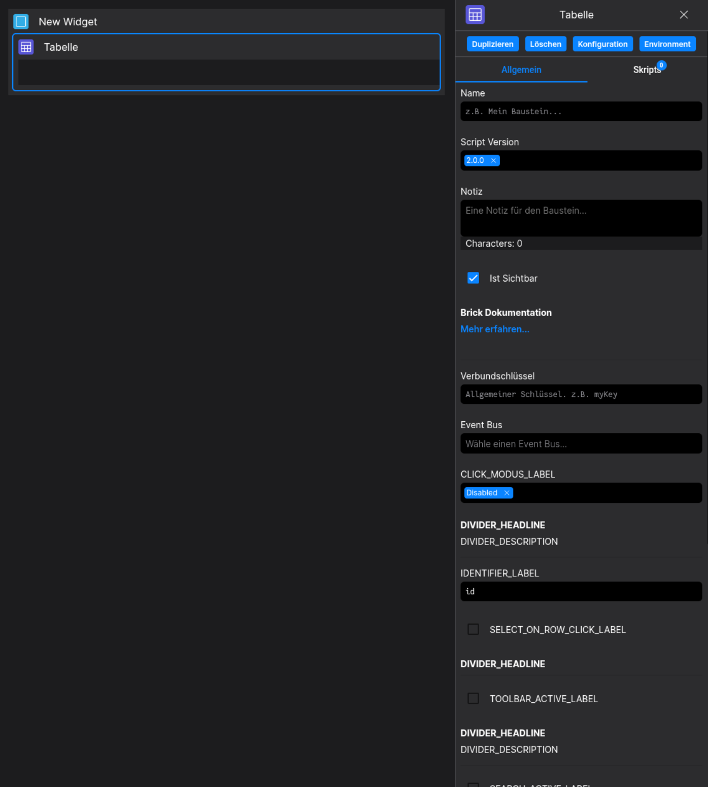
🛠️ Usage
Designer
(Use the build in configuration Inputs in the right Side-Nav)
Config
(Edit the whole configuration of the Table to your liking)