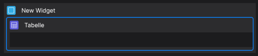
Table
📘 Developer Guide
With the Table Brick, you are able to implement a fully fledged Table into your Dashboards. The Table supports several features. Check the Configuration Properties for more information.
You can place multiple Table Components inside the Table Brick to define a highly customizable layout.
🔁 Example
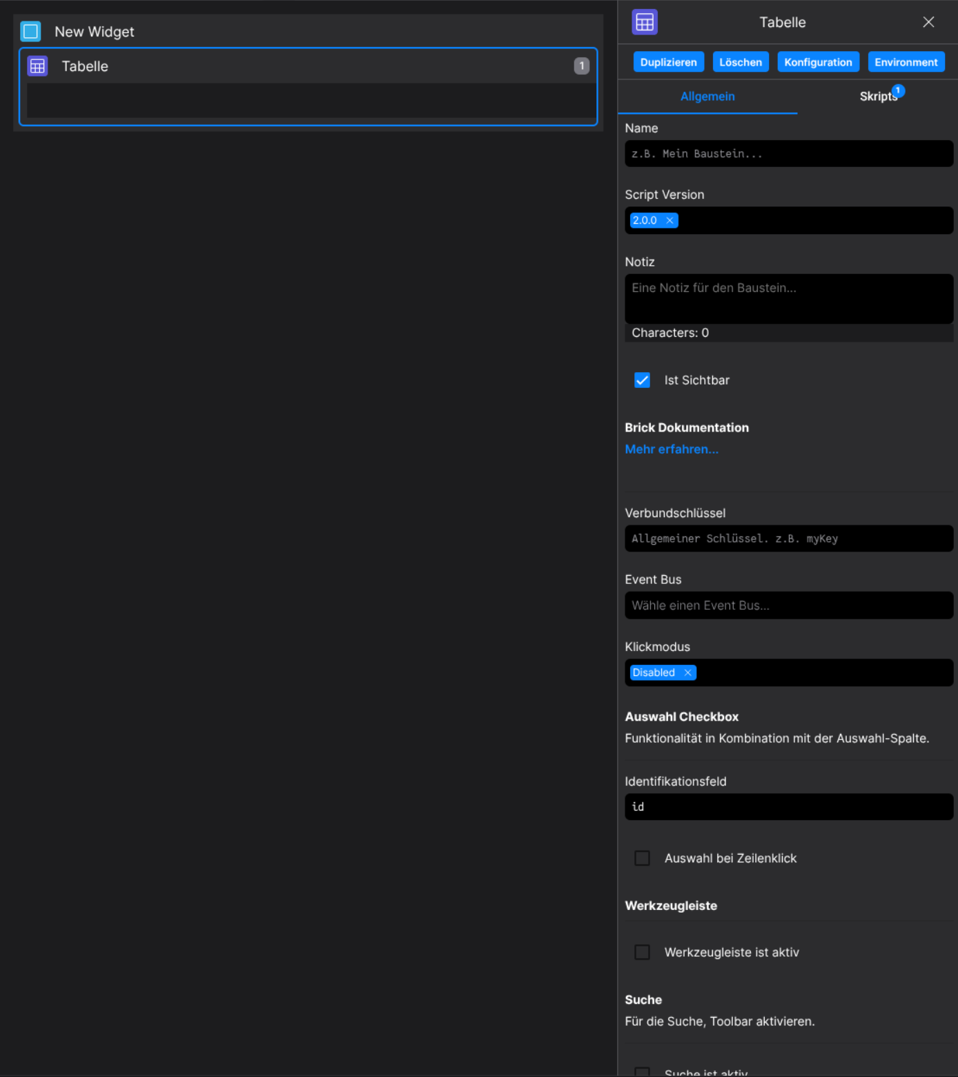
Designer

Runtime
⚙️ Configuration Properties
config
| Key |
Label |
Description |
Default Value |
grid |
The Data Table Grid Definition |
Holds the definition of header and body columns. Find out more under HeaderColumn and BodyColumn
{ header: HeaderColumn[][], body: BodyColumn[] } |
- |
defaultStyles |
Default Table Styles |
Defines default styles for header and body TableDefaultStyles |
- |
click.modus |
Defines if the table focuses specific sections of the table on click |
Determines clickable area of the table row | cell | none |
none |
select |
The selection configuration |
Defines row or cell selection behavior. Find out more under SelectionConfig SelectionConfig |
- |
sorting |
The sorting configuration |
Defines how sorting is handled. Find out more under SortingConfig SortingConfig |
- |
search |
The search configuration |
Defines table search behavior. Find out more under SearchConfig SearchConfig |
- |
pagination |
The pagination configuration |
Defines paging behavior. Find out more under PaginationConfig PaginationConfig |
- |
footerConfig |
The footer configuration |
Configuration for the table’s footer. Find out more under FooterConfig FooterConfig |
- |
toolbarConfig |
The toolbar configuration |
Configuration for the table’s toolbar. Find out more under ToolbarConfig ToolbarConfig |
- |
data |
The data of the table |
Defines the data which is being processed by the table any[] |
[] |
BodyDefaultStyles (config.defaultStyles.body)
| Key |
Label |
Description |
Default Value |
nowrap |
If text is text only single lined |
If true, text will be in one line boolean |
false |
height |
The height of each body cell |
Accepts a string like 42px string |
42px |
minHeight |
The minimum height of each body cell |
Accepts a string like 50px string |
null |
padding |
The padding of each body cell |
Accepts a string like 12px 5px 12px 5px (Top, Right, Bottom, Left) string |
0px |
font.size |
The font size of each body cell |
Accepts a string like 14px string |
12px |
font.weight |
The font weight of each body cell |
Accepts a string like 400 or bold string |
normal |
font.color |
the font color of each body cell |
Accepts a string like #000 or rgb(0,0,0) string |
- |
outsideBorder |
Toggles the outside border visibility of cells |
Accepts either true or false boolean |
false |
| Key |
Label |
Description |
Default Value |
title |
The toolbar title |
Title displayed in the action toolbar string |
- |
sorting |
The sorting configuration |
Defines how sorting is handled. See SortingConfig |
- |
search |
The search configuration |
Defines table search behavior. See SearchConfig |
- |
headerColumns |
Defines the header columns |
Array of header columns displayed in the toolbar HeaderCell[] |
- |
actions.addButtonVisible |
Toggles the add button visibility |
Accepts either true or false boolean |
- |
actions.addButtonLabel |
Defines the add button label |
string |
- |
actions.addMoreButtonVisible |
Toggles the add more button visibility |
Accepts either true or false boolean |
- |
| Key |
Label |
Description |
Default Value |
visible |
Toggles the toolbar visibility |
Shows or hides the manipulation toolbar boolean |
- |
headerColumns |
Defines the header columns |
Columns displayed in the manipulation toolbar HeaderCell[] |
- |
sortingQuery |
Defines the sorting query |
See SortingChangeEvent |
- |
filteringQuery |
Defines the filtering query |
See SearchChangeEvent |
- |
actions.saveVisible |
Toggles the save button visibility |
Accepts either true or false boolean |
- |
actions.saveMoreVisible |
Toggles the save more button visibility |
Accepts either true or false boolean |
- |
actions.resetVisible |
Toggles the reset button visibility |
Accepts either true or false boolean |
- |
| Key |
Label |
Description |
Default Value |
active |
Toggles the toolbar |
Accepts either true or false boolean |
- |
headerColumns |
Defines the header columns |
Columns displayed in the toolbar HeaderCell[] |
- |
actionToolbarConfig |
The action toolbar configuration |
Defines the action toolbar behavior. See ActionToolbarConfig |
- |
manipulationToolbarConfig |
The manipulation toolbar configuration |
Defines the manipulation toolbar behavior. See ManipulationToolbarConfig |
- |
sticky.active |
Toggles the sticky toolbar |
Accepts either true or false boolean |
- |
sticky.position |
Sets the toolbar's sticky position |
top | bottom |
- |
SelectionConfig (config.select)
| Key |
Label |
Description |
Default Value |
selectOnRowClick |
Toggles select on row click behavior |
Accepts either true or false boolean |
- |
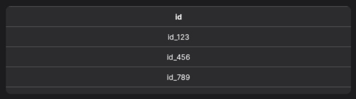
identifier |
The selection identifier |
Key of the object which is selected (string) |
'id' |
SortingConfig (config.sorting)
| Key |
Label |
Description |
Default Value |
mode |
Defines the data manipulation mode |
Accepts either local or remote DataManipulationMode |
- |
active |
Toggles sorting is active |
Enables or disables sorting boolean |
- |
visible |
Toggles sorting visibility |
Shows or hides sorting UI boolean |
- |
query |
Defines the sorting query |
See SortingChangeEvent |
- |
SearchConfig (config.search)
| Key |
Label |
Description |
Default Value |
mode |
Defines the data manipulation mode |
Accepts either local or remote DataManipulationMode |
- |
active |
Toggles if search is active |
Accepts either true or false boolean |
- |
visible |
Toggles if search is visible |
Accepts either true or false boolean |
- |
filterActive |
Toggles if filter is active |
Accepts either true or false boolean |
- |
filterVisible |
Toggles if filter is visible |
Accepts either true or false boolean |
- |
query |
Defines the filtering query |
See SearchChangeEvent |
- |
searchPlaceholder |
Defines the search placeholder |
Placeholder text for the search input string |
- |
globalSearchFilter |
Defines the global search filter |
See SearchChangeEvent |
- |
HeaderColumn
| Key |
Label |
Description |
Default Value |
propPath |
The property path |
Optional property path identifier string |
- |
title * |
The title of the header column |
string |
- |
width |
The width of the column |
Width of the column string |
- |
defaultStyles |
The default styles of the column |
Defines the style of the column. See HeaderDefaultStyles HeaderDefaultStyles |
- |
icon |
The icon configuration of the column |
Defines the icon of the column. See FyzSbIconConfig FyzSbIconConfig |
- |
BodyColumn
| Key |
Label |
Description |
Default Value |
propPath * |
The property path |
Property path identifier string |
- |
defaultStyles |
The default styles of the column |
Defines the style of the column. See BodyDefaultStyles BodyDefaultStyles |
- |
data |
The attached data |
Data to attach to the column any |
- |
tooltip |
The tooltip options |
Defines the tooltip of the column. See TooltipOptions TooltipOptions |
- |
TooltipOptions (BodyColumn.tooltip, BodyCell.tooltip)
| Key |
Label |
Description |
Default Value |
tooltipProp |
The tooltip property of which the text is taken |
Accepts a string string |
- |
tooltipFunction |
The tooltip function which computes the tooltip |
Provide a function as string which returns the tooltip as string |
- |
BodyCell
| Key |
Label |
Description |
Default Value |
propPath * |
The property path |
Property path identifier. Enables the Column to access table data under that propPath string |
- |
defaultStyles |
The default styles of the column |
Defines the style of the column. See BodyDefaultStyles BodyDefaultStyles |
- |
isClicked |
Defines if the Cell is clicked |
Accepts either true or false boolean |
- |
data.row |
The data used in the row of the cell |
Accepts every form of data any |
- |
data.column |
The data used in the column of the cell |
Accepts every form of data any |
- |
tooltip |
The tooltip options |
Defines the tooltip of the column. See TooltipOptions TooltipOptions |
- |
computedTooltip |
The computed tooltip after computation of the TooltipFunction |
Defines the computed tooltip of the column. See TooltipOptions TooltipOptions |
- |
component |
The Component used in the cell |
Define the component as string. See Table-Components. Defaults to a Default-Column if nothing specified { component: string, config: any } |
- |
x |
The x-Position of the Cell |
number |
- |
y |
The y-Position of the Cell |
number |
- |
colspan |
The vertical size of the cell |
number |
- |
rowspan |
The horizontal size of the cell |
number |
- |
styles |
The style of the cell |
Partial<CSSStyleDeclaration> |
- |
🛠️ Usage
Designer
(Use the built-in configuration inputs in the right Side-Nav)

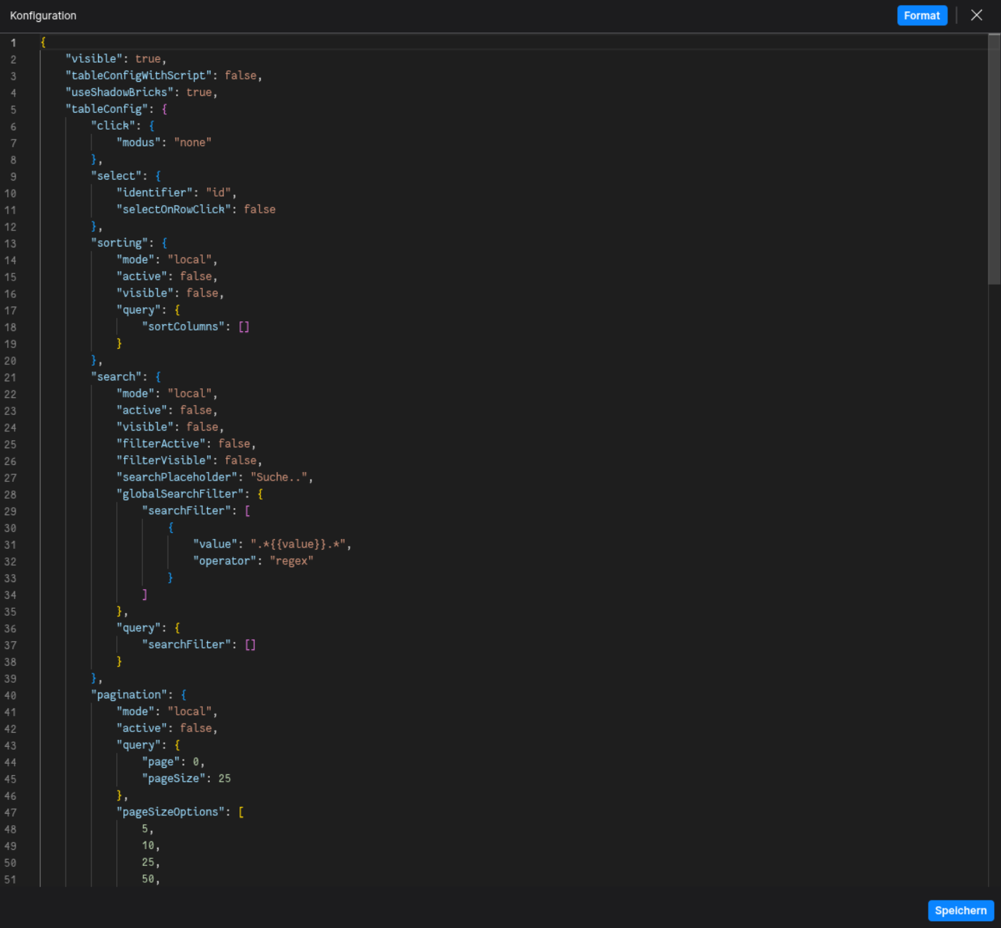
Config
(Edit the configuration of the Table to your liking)
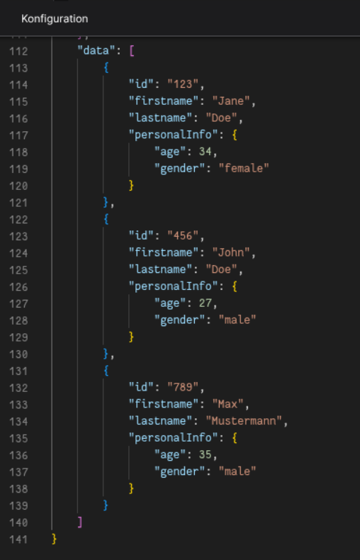
⌨️ Programmatical Data
Set initial table data
This example shows how to define an initial dataset directly in the configuration.
(To display the data in runtime, use Table Components)

Update table data via scripting
Example script to update table data dynamically:
// ⚙️ Retrieve the current configuration of the Brick
const config = fyzBrick.cRef.getConfig();

// 💱 Modify and merge the config to update the table
fyzBrick.cRef.mergeConfig({
  ...config,
  data: [
    { firstname: "John", lastname: "Rambo", personalInfo: { age: 62, gender: "beast" } },
    { firstname: "John", lastname: "Wick", personalInfo: { age: 47, gender: "male" } },
  ]
});