Tabtoggle
📘 Developer Guide
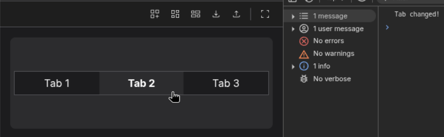
With the Tab-Toggle Brick, you can provide a Tab-Selector which fires action on click with specific information about which Tab is now selected.
See 2.2. for a working example
🔁 Example
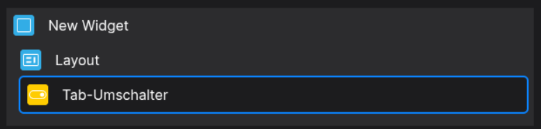
Designer
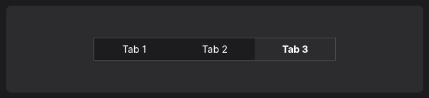
Runtime
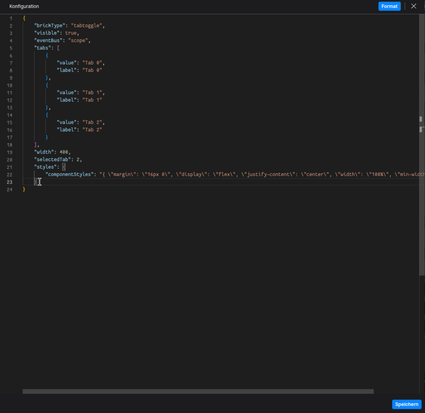
⚙️ Configuration Properties
Config
| Key | Label | Description | Default Value |
|---|---|---|---|
tabs * |
An array containing Tab-Items | Accepts Tab-Items which are specified by a specific Object-Structure{ value: string, label: string }[] |
- |
width |
The Width of each Tab-Item | Sets the width of each Tab-Item, accepting a number, which will be interpreted in pixel.number |
- |
selectedTab |
The Index of the selected Tab | Accepts a valid index of a tabnumber |
0 |
styles |
Build in In-Line Styles for the Component | Accepts a List of style declarations, e.g. {backgroundColor: red;}CSSStyleDeclaration |
- |
🛠️ Usage
Designer
(Use the build in configuration Inputs in the right Side-Nav)
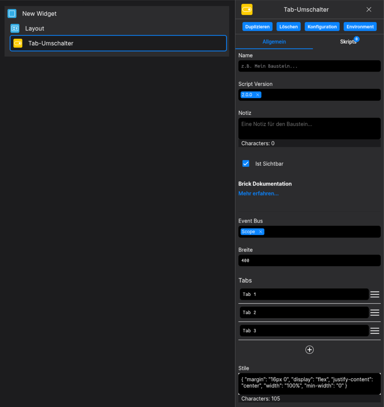
Config
(Edit the whole configuration of the Tab-Toggle to your liking)
⌨️ Programmatical Data
How to change your Tabs via Scripting
// ⚙️ Retrieve the current configuration of the Brick
const config = fyzBrick.cRef.getConfig();

// 💱 Modify and merge the config to change to the desired tab/behavior
fyzBrick.cRef.mergeConfig({
	...config,
	tabs: [...config.tabs, { value: "new-tab", label: "Tab via Scripting" }]
})
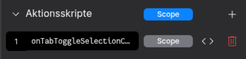
How to react to tab selections via scripting
Define an Action-Script named after onTabToggleSelectionChanged
(Keep an eye on the Event-Bus Scope!)
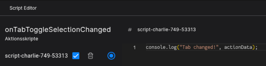
The actionData contains the following information:
{ actionName: string, buttonText: string, id: number }
Click a Tab to trigger a tab change.