
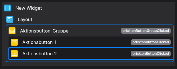
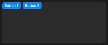
Action-Button Group
📘 Developer Guide
With the Action-Button Group Brick, you can easily add multiple grouped Buttons to your dashboards.
You are able to listen to the Actions, which will be emitted on Button click to react with Scripting onto them.
🔁 Example
Designer
Runtime
⚙️ Configuration Properties
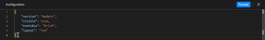
Config
| Key | Label | Description | Default Value |
|---|---|---|---|
id |
ID of the Button | Can be selected using CSS via #flyze-button-idstring UUID |
Random UUID |
orderId |
The order of button groups | Accepts a number. Allows ordering the groups to your liking.number |
- |
version |
Decider for the version of the Button | Always use modern, since legacy will be removed in the future.It just exists for backward compatibility modern legacy |
legacy |
layout |
The layout of the action button group | Allows switching between predefined layouts.row | column |
row |
buttons * |
The Buttons within the group | Accepts an array of Action-Button configs.FyzSbActionButtonConfig[] |
[] |
🎨 CSS Variables
(These variables allow you to override predefined states without using !important)
🛠️ Usage
Config
(Edit the whole configuration of the Button-Group to your liking)
⌨️ Programmatical Data
How to style the layout
This example shows how to style your Button-Group via CSS.
[layout="row"] {
  --fyz-sb-button-group-direction: row-reverse;
  justify-content: center;
  align-items: center;
}
Use the Layout Brick to style groups based on this example.
How to update the Button-Group via Scripting
// ⚙️ Retrieve the current configuration of the Brick
const config = fyzBrick.cRef.getConfig();

// 🏭 Define a new Button
const newButton = {
  version: "modern",
  text: "Hit me up",
  tooltip: "I dare you",
  visible: true,
  show: true,
  eventBus: "brick",
  state: "default",
  shortcut: {
    key: "a",
    ctrlKey: true,
    altKey: true,
    shiftKey: false
  },
  prefixIcon: {
    version: "modern",
    iconCategory: "social",
    iconName: "eco",
    size: "small"
  },
  suffixIcon: {
    version: "modern",
    iconCategory: "action",
    iconName: "play",
    size: "default"
  }
};

// 💱 Modify and merge the config to change to the desired button-group/behavior
fyzBrick.cRef.mergeConfig({ ...config, layout: "column", buttons: [newButton, newButton] });