Action-Button
📘 Developer Guide
With the Action-Button Brick, you can easily add Buttons to your dashboards.
You are able to listen to the Actions, which will be emitted on Button click to react with Scripting onto them.
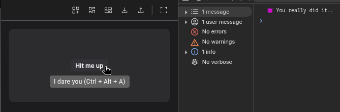
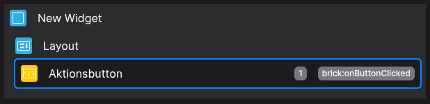
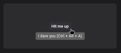
🔁 Example
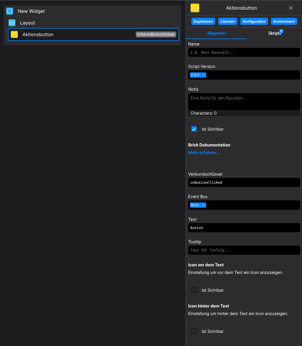
Designer
Runtime
⚙️ Configuration Properties
Config
| Key | Label | Description | Default Value |
|---|---|---|---|
show |
Visibility of the Button | Accepts either true or false (boolean) |
true |
id |
ID of the Button | Can be selected using CSS via #flyze-button-id string UUID |
Random UUID |
version |
Decider for the version of the Button | Please always use modern, since legacy will be removed in the future! It just exists for backward compability purposes modern legacy |
legacy |
text |
The text inside the Button | Accepts strings (string) |
- |
tooltip |
Displays a tooltip on hover | Accepts a string, which will be set inside the tooltip wrapper (string) |
- |
state |
The state of the button | Allows to switch between pre defined states. Use custom to define your own state. default | inverted | transparent | disabled | hover | custom |
default |
size |
The size of the button | Allows to switch between pre defined sizes. Use custom to define your own size. xsmall | small | default | medium | large | custom |
default |
customStateName |
The custom state attribute name | e.g. insane Lets you create your own custom state. You can target via CSS with [state="insane"] |
string |
customSizeName |
The custom size attribute name | e.g. massive Lets you create your own custom size. You can target via CSS with [size="massive"] |
string |
Shortcut (config.shortcut)
| Key | Label | Description | Default Value |
|---|---|---|---|
key |
The key to be pressed | Accepts keys as strings e.g. a Once this is set, the shortcut will be available |
string |
ctrlKey |
Enables the Ctrl-Modifier | Accepts either true or false (boolean) |
- |
altKey |
Enables the Alt-Modifier | Accepts either true or false (boolean) |
- |
shiftKey |
Enables the Shift-Modifier | Accepts either true or false (boolean) |
- |
Prefix-Icon (config.prefixIcon)
Suffix-Icon (config.suffixIcon)
🎨 CSS Variables
(These variables will even allow you to override predefined states without the use of !important)
:root {
/* State specific */
-–fyz-sb-buton-bg /* translates to the background-color of the button */
-–fyz-sb-button-color /* translates to the text color of the button */

/* Size specific */
-–fyz-sb-button-font-size /* translates to the font-size of the button */
-–fyz-sb-button-height /* translates to the height of the button */
–-fyz-sb-button-padding /* translates to the padding of the button (Top, Right, Bottom, Left) */
–-fyz-sb-button-radius /* translates to the border-radius of the button */
}
🛠️ Usage
Designer
(Use the build in configuration Inputs in the right Side-Nav)
Config
(Edit the whole configuration of the Button to your liking)
⌨️ Programmatical Data
How to style custom States/Styles
This example shows, how to style your Button via CSS
(For this example we set customStateName to insane and customSizeName to round-massive)
[state="insane"] {
--fyz-sb-button-bg: red;
--fyz-sb-button-color: yellow;
}
[state="insane"]:hover {
--fyz-sb-button-bg: blue;
}

[size="round-massive"] {
--fyz-sb-button-font-size: 32px;
--fyz-sb-button-height: 78px;
--fyz-sb-button-padding: 12px 8px 12px 8px;
--fyz-sb-button-radius: 50%;
}
Use the Layout Brick to style buttons based on that example
How to update the Button via Scripting
// ⚙️ Retrieve the current configuration of the Brick
const config = fyzBrick.cRef.getConfig();

// 💱 Modify and merge the config to change to the desired button/behavior
fyzBrick.cRef.mergeConfig({
...config,
text: 'Hello, i am updated!',
shortcut: {
key: 'a',
ctrlKey: true,
shiftKey: true,
altKey: false
},
state: 'custom',
customStateName: 'updated-button'
})
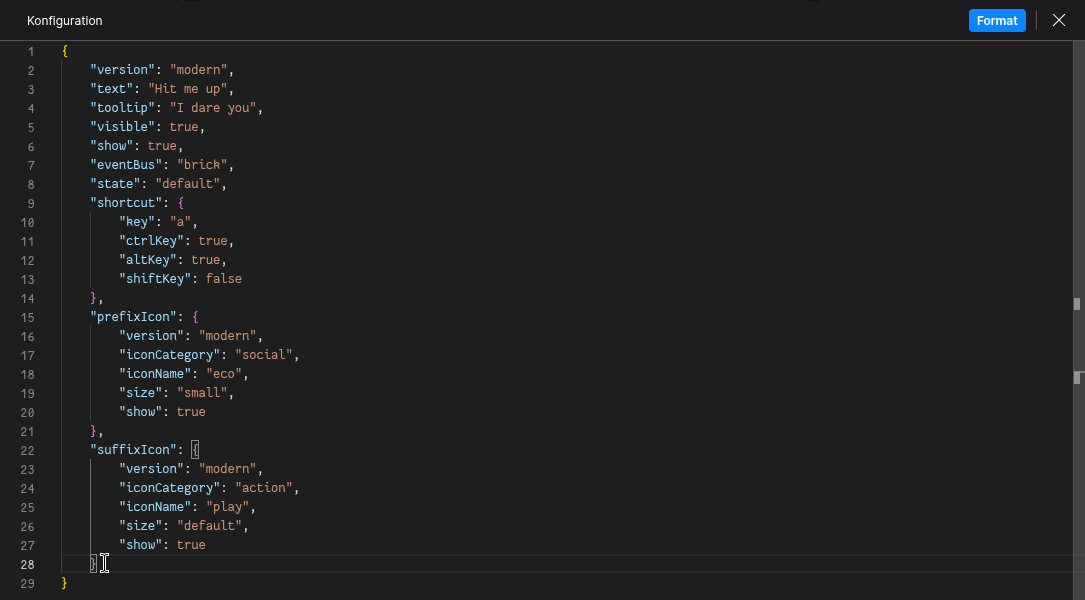
Example of a fully fletched Button config
{
  "version": "modern",
  "text": "Hit me up",
  "tooltip": "I dare you",
  "visible": true,
  "show": true,
  "eventBus": "brick",
  "state": "default",
  "shortcut": {
  "key": "a",
  "ctrlKey": true,
  "altKey": true,
  "shiftKey": false
  },
  "prefixIcon": {
    "version": "modern",
    "iconCategory": "social",
    "iconName": "eco",
    "size": "small"
  },
  "suffixIcon": {
    "version": "modern",
    "iconCategory": "action",
    "iconName": "play",
    "size": "default"
  }
}
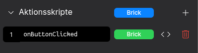
Example of reacting to a button action
Define a Relation-Key in the Button-Configurator
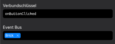
Define a Action-Script named after your Relation-Key
(Keep an eye on the Event-Bus Scope!)
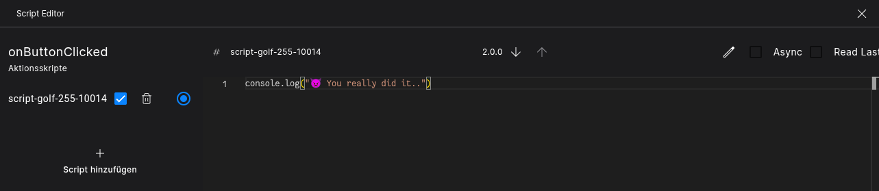
You'd better push the button and let me know 🤓